
Executive Summary
In the United States there is credible evidence that poorer communities get a worse deal from the electricity network. A study of 15 million customers' outages during the 2017–2020 hurricane seasons, across 588 counties, found each one-decile drop in an area's socioeconomic status was associated with a 6.1% longer outage — roughly 170 extra minutes waiting for restoration (Ji, Ganz & Duan, PNAS Nexus, 2023). And in Ohio, an analysis of utility grid data found the infrastructure serving disadvantaged communities was 3.4–4.2 years older, twice as likely to be on low-voltage circuits, and carried 10.5–23% less capacity than in other areas (Banton, Grid Disparity Analyses in FirstEnergy Service Territory, Interstate Renewable Energy Council, March 2025). Whether anything similar holds in New Zealand has barely been examined — and the Commerce Commission's information disclosure regime makes it testable.
This report links every zone substation we can locate to the deprivation decile of its surrounding meshblock (via a spatial join to Stats NZ meshblock polygons) and tests three dimensions of network quality against deprivation: capacity headroom, asset condition, and unplanned outage performance.
The short answer: infrastructure quality shows no deprivation gradient at the asset level, but outage experience does at the network level — and the mechanism appears to be rurality rather than under-investment in poorer communities.
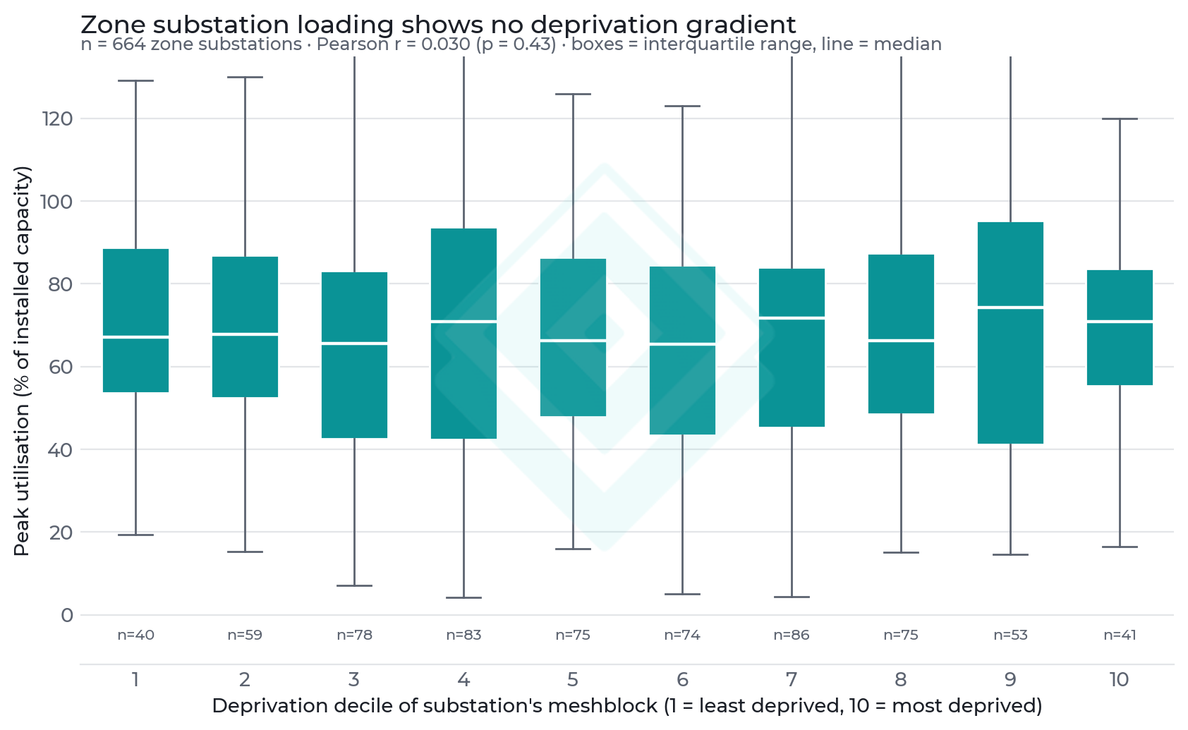
- Capacity headroom: across 664 zone substations matched to a deprivation decile, peak utilisation is statistically indistinguishable by deprivation (Pearson r = 0.03, p = 0.434). Substations in the most deprived areas run no closer to their limits than those in the wealthiest.
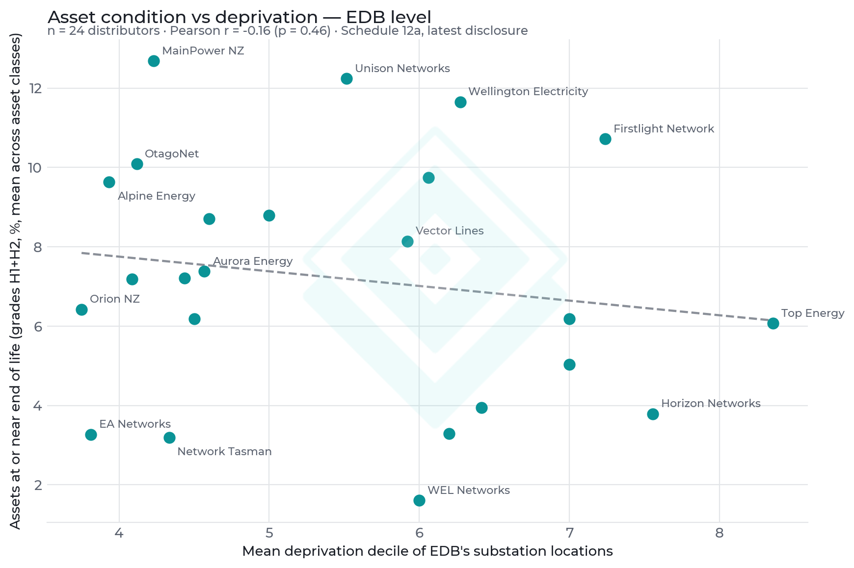
- Asset condition: the share of assets at or near end of life (condition grades H1+H2) is uncorrelated with the deprivation of the areas a distributor serves (r = -0.16, p = 0.455 across 24 distributors) — if anything the sign is negative, i.e. higher-deprivation networks report slightly newer assets.
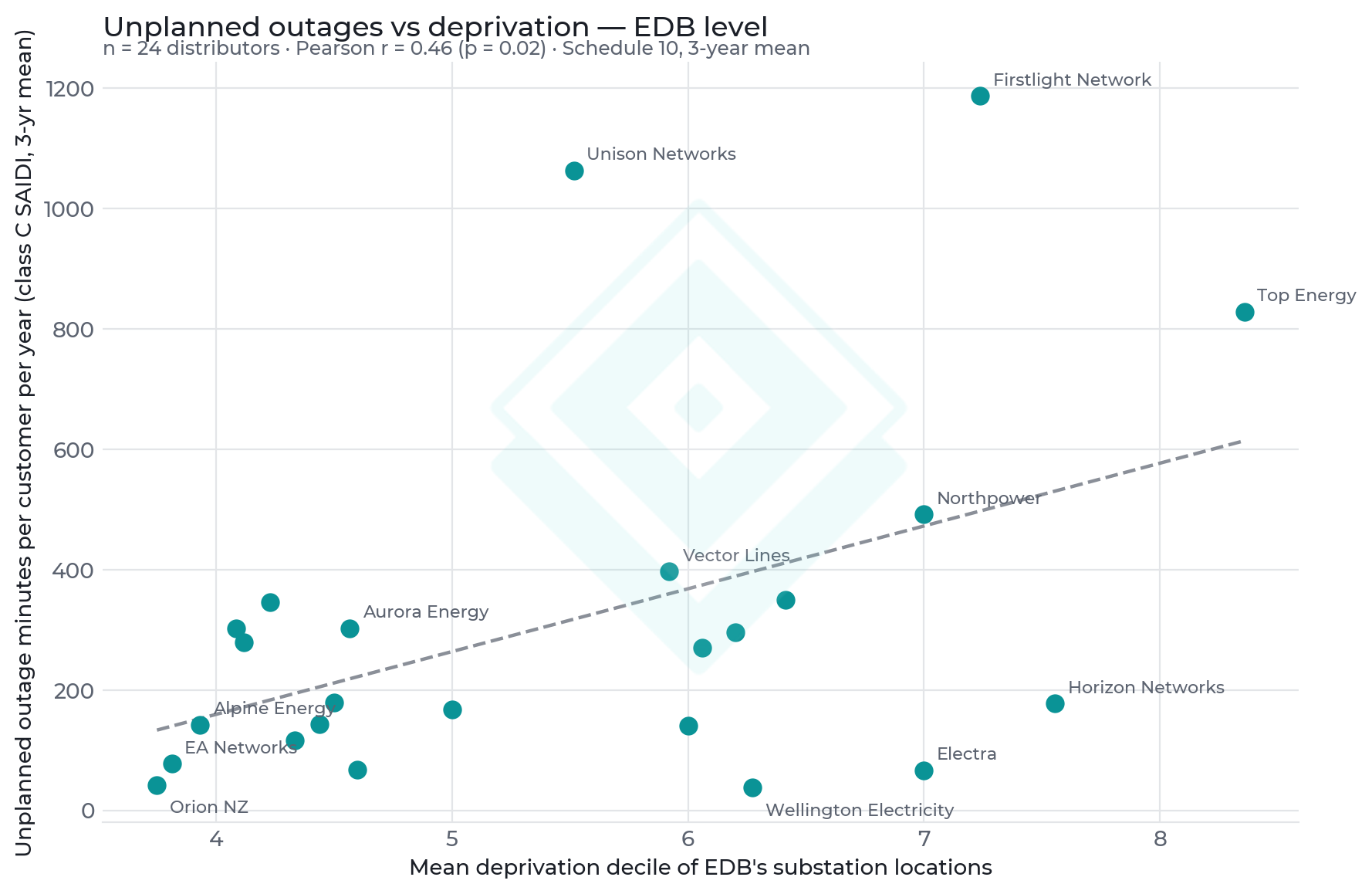
- Reliability is the exception: unplanned outage minutes (class C SAIDI, 3-year mean) correlate positively and significantly with deprivation (r = 0.461, p = 0.024). Customers of the most deprivation-exposed networks (Firstlight/Tairāwhiti, Top Energy/Far North) experience 800–1,200 unplanned minutes per year, versus ~40–70 for Orion (Christchurch) and Wellington Electricity.
- The outage gradient tracks rurality, not neglect: deprived areas in New Zealand skew rural, and rural networks have long, exposed, low-density feeders. Urban networks serving deprived areas (e.g. Vector, Wellington Electricity) perform close to their wealthy-area peers on every measure.
Test 1 — Capacity Headroom at the Substation
Each zone substation's location was matched to the deprivation decile of its meshblock via a point-in-polygon spatial join, then to its Commerce Commission Schedule 12b disclosure via normalised name matching (664 zone substations). If deprived areas were systematically under-built, their substations would run hotter at peak. They don't: median peak utilisation sits between 65% and 75% in every deprivation decile, and the overall correlation is zero.
Test 2 — Asset Condition
Schedule 12a discloses the condition-grade profile of every major asset class on the industry's asset health scale (H1 = replacement recommended, through H5 = as-new). We average the share of assets in the two worst grades across asset classes for each distributor, and compare it with the mean deprivation decile of that distributor's substation locations. There is no significant relationship. The networks with the oldest asset bases (MainPower, Unison, Wellington Electricity, OtagoNet) span the full deprivation range, and the most deprivation-exposed network of all (Top Energy, Far North) reports one of the newer asset fleets.
Test 3 — Unplanned Outages
Where quality does diverge is in what customers actually experience. Class C SAIDI — unplanned outage minutes per customer per year attributable to the distributor's own network, averaged over the three latest disclosure years to smooth storm effects — rises significantly with deprivation exposure.
The pattern is dominated by rural, remote networks: Firstlight (Tairāwhiti), Top Energy (Far North), Northpower and Unison sit high on both axes. These regions combine high deprivation with long overhead feeders through forested, cyclone-exposed terrain. Urban networks serving substantial deprived populations — Vector (Auckland) and Wellington Electricity — deliver among the best reliability in the country. Deprived communities do spend materially more hours without power each year; the data points to geography — long rural feeders — rather than poorer local assets as the cause.
Methodology
- Deprivation: deprivation deciles from the 2018 New Zealand Index of Deprivation (University of Otago / Stats NZ), meshblock level; decile 1 = least deprived, 10 = most deprived. Each zone substation point is assigned the decile of the meshblock polygon containing it (Athena spatial join).
- Substation locations: GIS zone-substation point layer covering 27 of 29 distributors (784 sites, 776 matched to a meshblock).
- Utilisation: Commerce Commission Schedule 12b (each distributor's latest filing year, 2025–2026), peak utilisation = annual peak load ÷ installed capacity; matched to GIS sites by normalised substation name; implausible filed capacities (>200% utilisation) excluded.
- Asset condition: Schedule 12a condition grades, latest filing per distributor. Grades follow the EEA Asset Health Indicator scale — H1 = replacement recommended, H2/H3 = end-of-life drivers present, H4 = serviceable, H5 = as-new — verified against the EEA AHI Guide and empirically against 5-year replacement forecasts. Poor-condition share = unweighted mean of (H1+H2) across asset classes.
- Reliability: Schedule 10 class C (distributor-caused unplanned) SAIDI, mean of the three latest disclosure years per distributor.
- Distributor-level deprivation exposure = mean deprivation decile of that distributor's matched substation locations (distributors with fewer than five matched sites excluded; n = 24).
- Correlations are Pearson r with two-sided p-values.
Caveats
- Substation meshblock deprivation describes the immediate surroundings of the substation, not the full customer base it serves; industrial-zone substations sit in low-population meshblocks.
- The asset-condition mean is unweighted across asset classes (a distributor's poles and its SCADA system count equally); quantity-weighted condition is not disclosed consistently.
- The SAIDI series used here is the as-disclosed (raw) information-disclosure measure, which counts major storms in full. The Commission's separate price-quality compliance measure caps extreme events at a 'boundary value', so a compliance-normalised comparison would show a smaller — but still real — gap between rural and urban networks. Either way, SAIDI reflects storm exposure, vegetation and feeder length as well as investment choices, and the deprivation–SAIDI correlation should not be read as evidence of discriminatory under-investment.
- Deprivation deciles are 2018-census based; network disclosures are 2025–2026.