
Executive Summary
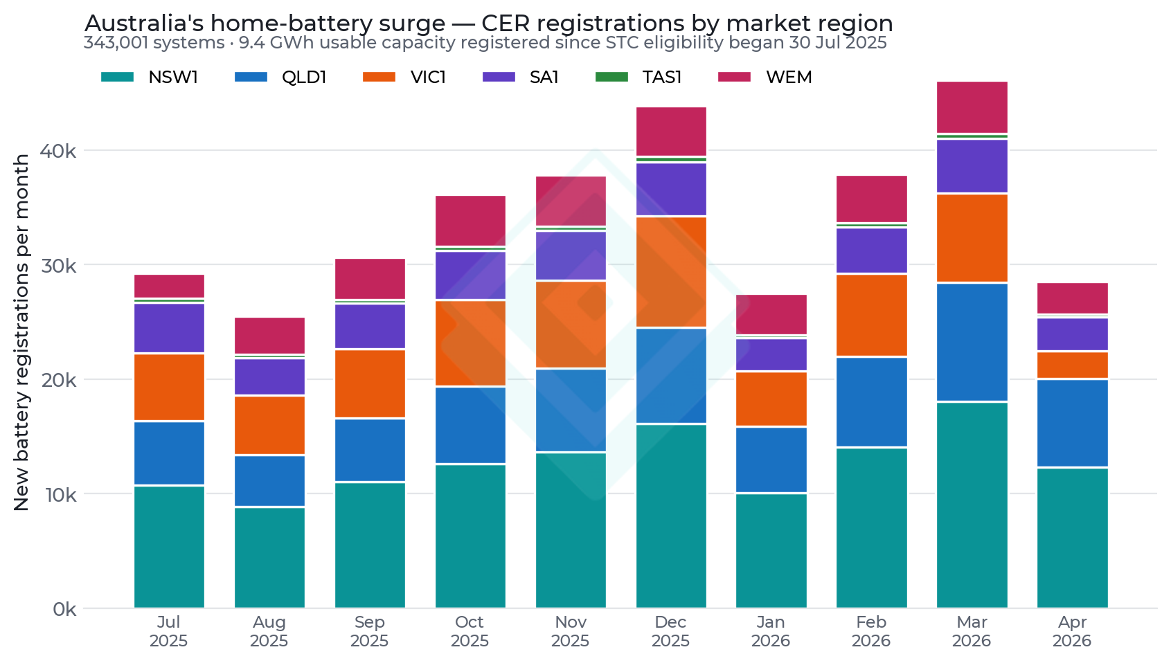
Australia's small-scale battery market changed step on 30 July 2025, when home batteries became eligible for small-scale technology certificates under the federal Cheaper Home Batteries programme. In the ten months to April 2026, 343,001 battery systems totalling 9.4 GWh of usable storage were registered with the Clean Energy Regulator — a capacity-weighted average of 27.4 kWh per system. That average is pulled up by a tail of large systems (the rebate scaled with capacity up to 50 kWh, with no size disincentive until May 2026): the most commonly installed size is roughly 19 kWh, against a typical pre-programme battery of about 11 kWh.
This report asks whether that fleet is yet visible in the shape of aggregate electricity demand — and closes with what Australia's experiment implies for New Zealand's distributed energy resource landscape.
- 343,001 battery systems (9.4 GWh usable) registered in the ten months to April 2026; capacity-weighted average 27.4 kWh, most common size ~19 kWh.
- NSW leads adoption relative to its solar base: batteries were added at a rate equal to 10.4% of its existing solar-equipped homes in ten months, ahead of South Australia (8.7%) and Victoria (7.3%).
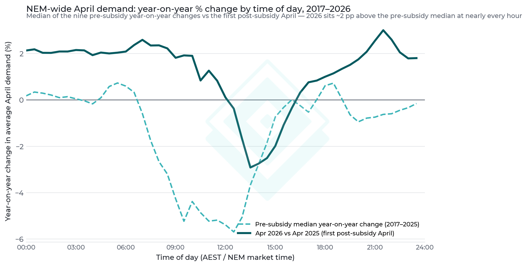
- The midday demand trough stopped collapsing: across nine pre-subsidy Aprils the median year-on-year change in midday demand was -3.8% per year; in April 2026, the first post-subsidy April, it was -0.7% — despite record rooftop-solar installs. Battery charging absorbing new solar output is the consistent explanation.
- No visible evening-peak shaving yet at NEM scale: the April evening peak rose +1.3% year-on-year (to 25.4 GW), in line with broad-based demand growth across all hours.
- For New Zealand: rooftop solar is already privately NPV-positive — the stronger candidate for government support is the battery, and the time to start thinking about it is now.
The Install Surge
Battery registrations jumped immediately when STC eligibility began, and have run at roughly 25,000–45,000 systems per month since. New South Wales accounts for the largest share, followed by Queensland and Victoria. Western Australia (WEM) participates in the same federal scheme and is shown alongside the five NEM regions.
Relative to each region's stock of solar-equipped homes, the ten-month battery uptake equals 10.4% of solar homes in NSW, 8.7% in South Australia, 7.3% in Victoria, 6.7% in WA, 5.9% in Queensland and 5.3% in Tasmania.
On size: the 27.4 kWh average is a capacity-weighted mean across all CER small-scale registrations (systems up to 100 kWh qualify). Published programme analyses put the most common installation near 19 kWh and the early-programme mean above 22 kWh — roughly double what a typical household needs, a direct response to a rebate that paid per kilowatt-hour. The May 2026 re-tiering of the rebate (discounts step down above 14 kWh and again above 28 kWh) is already pulling new-system sizes back toward the 20–30 kWh range.
Demand-Curve Impact — NEM-Wide
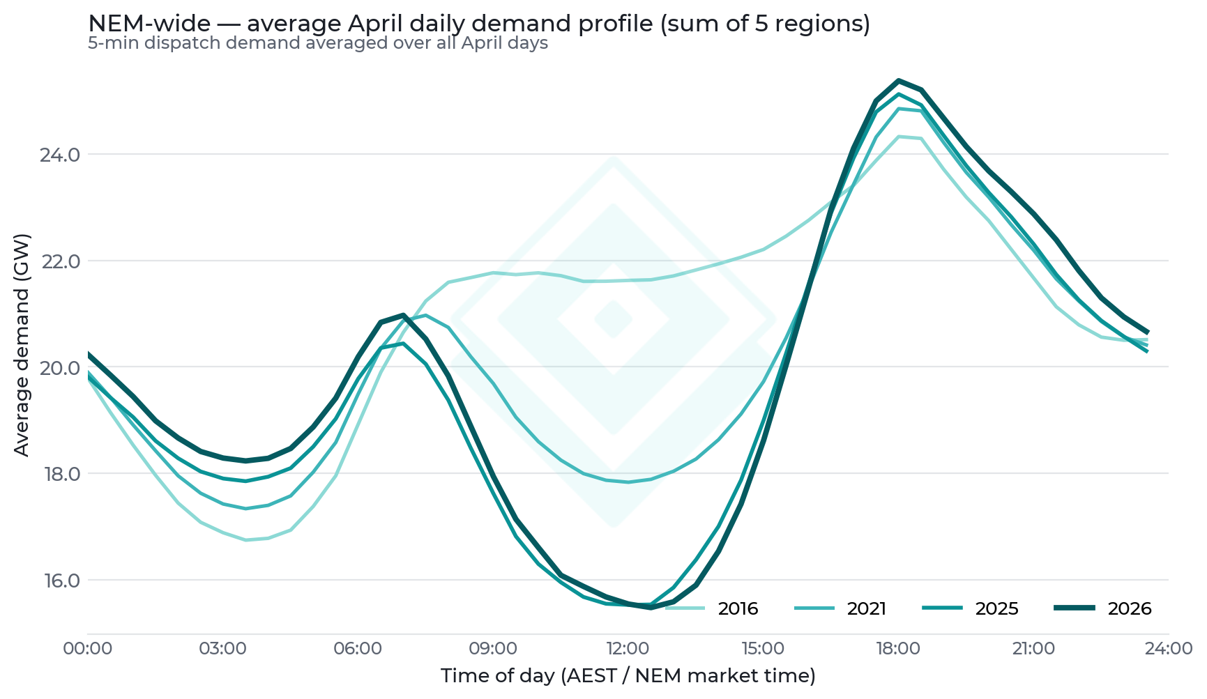
The long arc of the duck curve is unmistakable: NEM-wide average April midday demand has fallen from 21.6 GW in 2016 to 15.5 GW in 2026 as rooftop solar hollowed out the middle of the day, while the evening peak has risen from 24.3 GW to 25.4 GW. The peak-to-trough spread has widened from 2.7 GW to 9.9 GW.
The battery signal appears in the year-on-year change. In April 2026 — the first April after the surge began — demand was higher than a year earlier at every hour except the solar window, and the midday erosion largely stopped (−0.1 GW year-on-year, against −1.0 GW the year before). Rooftop solar kept growing through both periods, so a slowing of midday erosion is what battery charging behind the meter looks like in aggregate data: new solar output that previously suppressed operational demand is now partly diverted into storage.
At the evening peak the fleet is not yet separable from underlying demand growth (electrification, data centres and EV charging lifted demand at all hours in 2026). The spread's growth slowed to +0.3 GW year-on-year, versus an average of roughly +0.65 GW per year over 2021–2025.
A Decade of Shape Change, Hour by Hour
To separate the battery imprint from ordinary year-to-year noise, we compute the percentage change in average April demand for each half-hour of the day, for every consecutive pair of Aprils since 2016 — nine year-on-year changes before the subsidy began, and one after. The pre-subsidy pattern is a decade-long signature: midday demand eroding at a median -3.8% per year (bottoming near -5.7% in the early afternoon) while overnight and evening hours drifted roughly sideways (-0.2% per year at the evening peak).
April 2026 breaks the pattern. The post-subsidy line sits about two percentage points above the pre-subsidy median at 92% of half-hours: -0.7% at midday (a decade of ~4%-a-year erosion nearly halted) and +1.3% at the evening peak. Part of that uplift is genuine demand growth — electrification, data centres, EVs — but growth alone does not explain why the recovery is strongest relative to trend in exactly the hours when 9 GWh of new storage charges.
What This Means for New Zealand
New Zealand's 2026 election has put household energy hardware on the policy menu, and most of the framing is about subsidising rooftop solar. Our numbers suggest that is the wrong end of the equation. Solar in New Zealand already stands on its own: a 5 kW system pays back in 9 years (conservatively) at today's retail rates, with no subsidy required. A home battery does not (~16-year payback against a ~15-year life) — yet, as Australia's programme recognises, a battery delivers value beyond its owner's bill: it defers network investment, shaves the evening peak, and will earn a growing wholesale-timing dividend as solar uptake hollows out New Zealand's midday demand the way Figures 2 and 3 show it hollowed out Australia's. That is the textbook case for subsidising storage rather than generation, and New Zealand should start thinking about it now, before the duck curve arrives rather than after. How big that duck curve needs to be, and when an optimistic solar build gets us there, is the subject of our follow-up report, "Given the Lessons From Australia — Should NZ Subsidise Home Batteries?".
Methodology
- Battery and solar uptake: Clean Energy Regulator small-scale registration data (SRES), monthly new registrations by postcode aggregated to market region. Battery data begins July 2025, when batteries became STC-eligible; capacity is usable kWh. Average size = total registered kWh ÷ total systems (capacity-weighted mean across all CER registrations up to 100 kWh).
- Registrations lag physical installation by days to months (STC claim timing), and totals here cover all CER battery registrations — slightly above programme-only counts published by DCCEEW.
- Penetration = ten-month battery registrations divided by cumulative solar PV registrations in the same region (share of solar-equipped homes adding a battery).
- Demand: AEMO 5-minute dispatch regional demand (DISPATCHREGIONSUM totaldemand) for the five NEM regions, April of every year 2016–2026, averaged by 30-minute slot over all April days; NEM-wide = sum of regional averages. Times are NEM market time (AEST, no daylight saving). April is used as a shoulder month to minimise heating/cooling weather noise.
- Hour-by-hour trend (Figure 3): percentage change in each 30-minute slot's average April demand between consecutive years, giving nine pre-subsidy year-on-year changes (2017–2025) and one post-subsidy change (2026). Demand is operational (grid-supplied): rooftop-solar self-consumption and battery flows appear as changes in it.
- NZ solar economics: 5 kW at $2,300/kWp installed (2026 market guides); yield from adjusted global horizontal irradiance (solar_ghi_adjusted, Auckland/Wellington/Christchurch, 2021–2025 average = 1,124 kWh/kWp/yr at PR 0.80, tilt gain 1.10, 0.5%/yr degradation); 40% self-consumption at the median all-in retail rate (44 c/kWh incl. GST, MBIE regional quarterly survey, 43 towns, 2026 Q2), 60% exported at 12 c/kWh; 25-year life, 6% real discount rate. This is a conservative analysis: low-interest finance and higher self-consumption can significantly reduce solar payback times.
- NZ battery economics: 10 kWh usable at $1,200/kWh installed, 90% round-trip efficiency, 250 equivalent full cycles/yr (solar-paired), 15-year life. Private value = discharged energy at the all-in retail rate less charged energy at the buy-back rate. System value = wholesale timing (evening minus midday spot at the Haywards reference node HAY2201, rolling 10-year window 2016–2026) plus network/transmission deferral at 2 kW coincident peak reduction × Sapere LRMC ($74/kW/yr distribution + $97.8/kW/yr transmission).
- All NZ dollar figures are NZD; Australian registration figures are systems and usable GWh as filed with the CER.
Caveats
- Two Aprils can differ for weather reasons; the year-on-year framing reduces but does not eliminate this. Attribution of the slowed midday erosion to battery charging is an inference consistent with the data, not a measured battery dispatch series.
- Demand growth from electrification, data centres and EVs is confounded with battery discharge at the evening peak; the analysis can rule battery impact in at midday but only bound it at the peak.
- CER registrations understate the very latest months (late STC claims) — April 2026 figures will revise upward.
- The NZ economics use a representative national case. Self-consumption share (40%), cycling (250 cycles/yr), coincident peak contribution (2 kW) and the 12 c buy-back are mid-range assumptions; time-of-use tariffs, VPP participation, or high-rate regions improve the private battery case (see companion report), while the Sapere LRMC values are national averages — deferral value is materially higher on congested networks and lower where headroom is ample.
- Battery system value excludes reserves revenue, outage resilience, and dry-year hydro-conservation value (all positive, unquantified here) — the whole-system shortfall quantified in the companion report is therefore an upper bound on the true gap.
- Orchestration is the flip side of the subsidy case: as VPPs and ToU tariffs mature, more system value becomes privately capturable, and the required subsidy shrinks.