
Executive Summary
The usual advice to a household considering rooftop solar is that the value is in using the power yourself. Electricity bought from a retailer costs three to four times what a retailer pays for surplus exported back, so the return has always hinged on how much of the array's output the household could absorb at the moment it was generated.
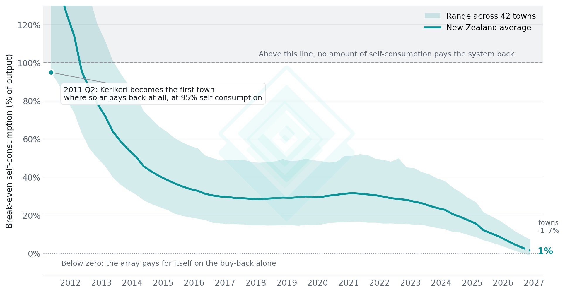
Using the power yourself still improves the return — it is no longer a condition of the investment being sound. We asked a narrow, checkable question of our platform: for a system installed in a given quarter, what fraction of its lifetime output must be consumed on site, rather than exported, for the investment to break even? We call that the break-even self-consumption share. It has fallen from above 100% in 2010, meaning no household could make the numbers work at any behaviour, to a national average of 5% in 2026-Q2.
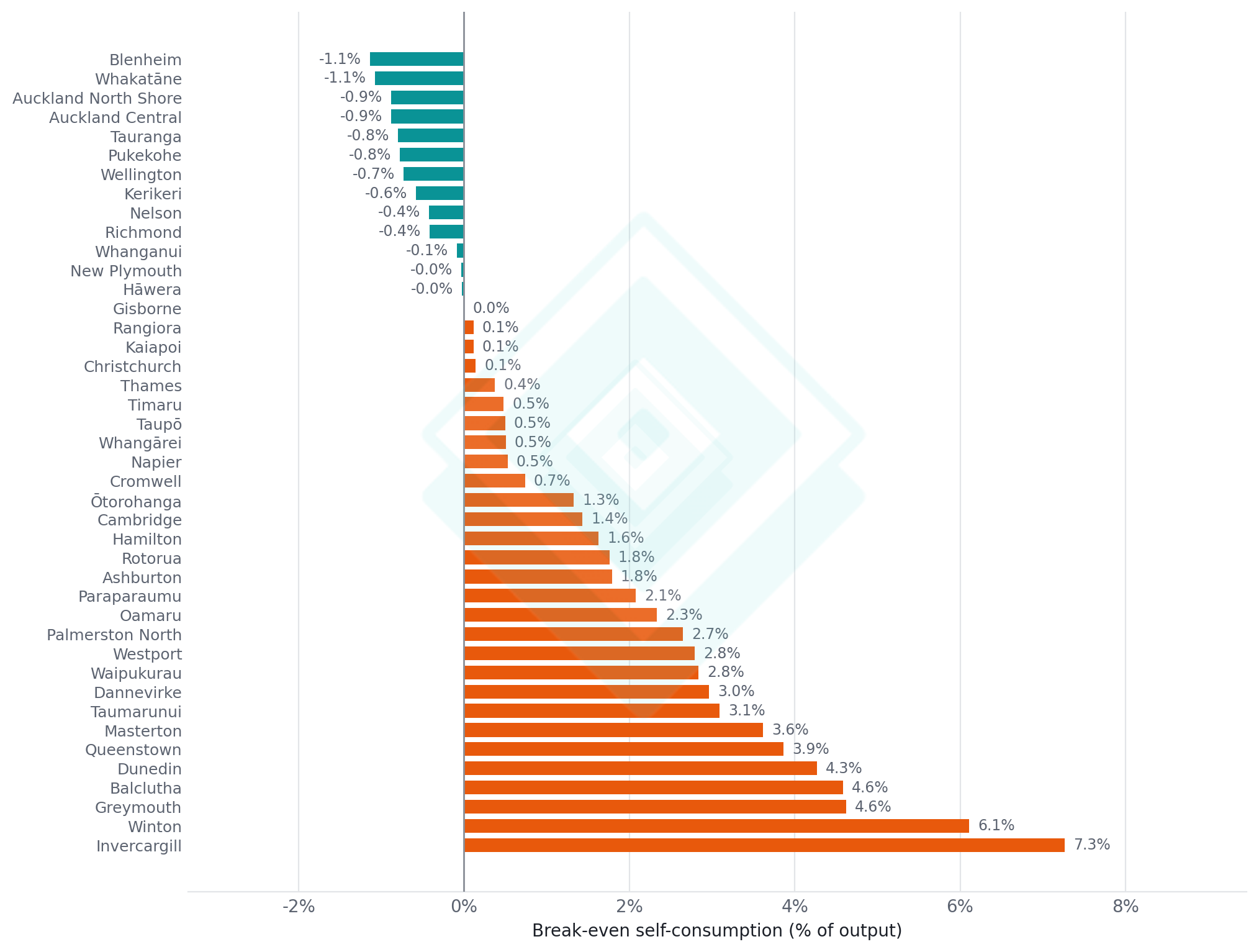
At that level a household no longer needs to reshape its day around the array — it pays for itself regardless. In 13 of the 42 towns we priced, our end-of-2026 projection puts the threshold below zero, meaning the system returns its cost on the export rate alone.
Installed cost and retail prices both moved, but not equally. Rising retail prices did their work early, while the threshold was high: a 1 c/kWh rise took 1.9 points off it in 2015 and takes 0.14 today. The rest is installed cost. Freeze the retail rate at its 2015 level and the threshold still falls to 8%. The final step to zero does not involve the retail price at all: a system breaks even on export alone once its lifetime cost per kWh falls below the buy-back rate, now 13.4c against 12c.
- Break-even self-consumption has fallen from above 100% to a national average of 5% (2026-Q2), and to a projected 1% by the end of 2026.
- The first town where rooftop solar paid back at all was Kerikeri, in 2011-Q2, and then only for a household consuming 95% of its own output.
- By the end of 2026 we project 13 of 42 towns below zero, where the array pays back on the 12 c/kWh buy-back alone.
A Threshold That Collapsed
The chart below tracks the break-even share by installation date. The line is the national average; the band is the full range across the 42 towns for which quarterly retail prices are published. In the shaded region above 100%, the investment cannot be recovered no matter how the household behaves.
The band's lower edge crosses first, in 2011-Q2, when a sunny town on a relatively expensive tariff becomes the first place in the country where the arithmetic closes. The national average follows a year later. Most of the fall is over by 2016, as the global collapse in module prices reaches New Zealand. The curve then stalls for most of a decade as installed costs bottomed out around 2017 and drifted back up through the pandemic. A second decline runs from 2023 as costs resume falling and retail prices climb.
The band also narrows as it falls. At the start, the gap between the best and worst town was 113 percentage points of required self-consumption; today it is under nine. In 15 years, rooftop solar has gone from a proposition that worked in one corner of the country to one that works everywhere.
Where It Lands, Town by Town
Separated by town, the ordering at the end of 2026 is a solar-resource story rather than a price story. The towns below zero are the sunny ones: the top of the North Island, the Bay of Plenty, and Blenheim, which has the strongest resource in the country in our modelling. The towns at the other end are in Southland, Otago and on the West Coast.
Balclutha shows this clearly. It pays the dearest electricity in the series at 52.5 c/kWh, well above the 44 c/kWh town median, which ought to make solar easy to justify there. It still needs 8% self-consumption against Blenheim's 1%, because a north-facing array in Blenheim yields 20% more per installed kilowatt. Once the threshold is near zero, output separates the towns and tariff barely does.
Invercargill sits at the top of the range. It combines the country's weakest solar resource (1,103 kWh per kWp) with a relatively cheap tariff (38.8 c/kWh, 38th dearest of 42), so neither side of the calculation helps it.
For a household, regional differences no longer decide the question. A spread of eight percentage points sits well inside the uncertainty of any individual roof: its pitch, its orientation, its shading.
Deriving the Cost Curve
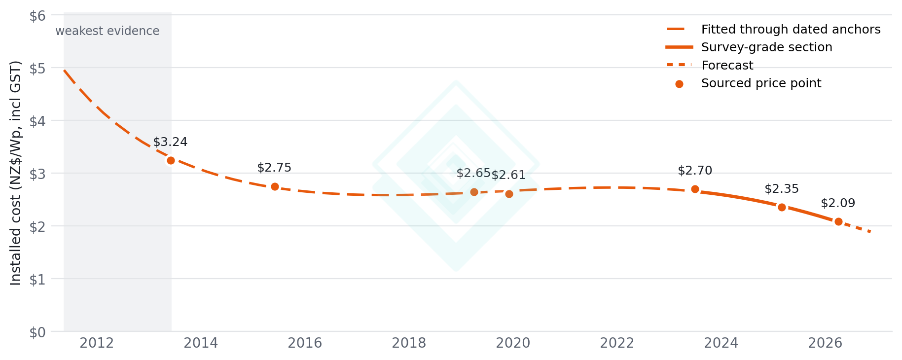
Installed costs fall steeply to the mid-2010s, bottom out near $2.60 per watt around 2017, drift back up to about $2.73 by 2022 as pandemic-era supply chains bite, then resume falling. On a like-for-like 5 kWp basis, 2015 sits just 1.13 times its 2025 level.
For contrast, the New Zealand Infrastructure Commission's 2026 energy review scales solar capital costs back to 2015 by a factor of 3.17. That multiplier is the ratio of the International Renewable Energy Agency's global weighted-average levelised cost of solar in 2015 against 2024. The Commission is explicit that it is an LCOE ratio rather than a pure capital cost one, so it also carries a decade of improvement in capacity factor and asset life. It is a global, utility-scale measure, and not the same quantity as an installed cost per watt on a New Zealand roof.
The two are worth putting side by side even so. Rooftop costs did fall hard, but earlier: most of their decline was over by the mid-2010s. Across the decade that followed, grid-scale solar economics improved several times over while New Zealand residential installed costs barely moved. Modules dominate a solar farm's bill; on a roof, labour, scaffolding, compliance and inverter make up enough of the cost that module deflation barely shows through.
Implications
For households, the load-shifting advice has not become wrong, only less important. Moving consumption into the middle of the day still improves the return. It is no longer the difference between a good investment and a bad one. The decision has moved to the ordinary questions of roof suitability, capital availability and how long the household expects to stay.
For retailers, the implication is less comfortable. Buy-back rates were set when exported solar was a by-product of a self-consumption proposition and barely affected whether a household bought solar. Once a system pays for itself on export alone, that rate becomes key to determining the return, and one households will shop around for.
Methodology
- Break-even condition: the self-consumption share s at which discounted lifetime value equals installed cost, s* = [C/(Y·A) − P_buyback] / (P_retail − P_buyback), where C is installed cost per kWp, Y first-year specific yield, and A the degradation-weighted annuity factor.
- Financial assumptions: 5 kWp system, 25 year life, 6% real discount rate (about 8.1% nominal at 2% inflation), 12 c/kWh buy-back, 0.5%/yr module degradation (annuity factor 12.222). Each installation vintage is valued at the capital cost and retail rate prevailing in that quarter, with both the retail rate and the buy-back then held constant in real terms across the life, so they rise with inflation in dollar terms.
- Retail rates: the all-in residential price, energy and lines together, which is the figure a household actually pays per kilowatt-hour, from the Ministry of Business, Innovation and Employment's quarterly regional electricity price data, covering 42 towns from 2004 to 2026 Q2. Self-consumed generation is valued at this rate because both components are avoided; exported generation is valued at the buy-back rate.
- Specific yield: a plane-of-array model for a north-facing array at 30° tilt, built from a month-by-hour climatology of ERA5 reanalysis irradiance accessed via Open-Meteo over 2017–2024, with a cell-temperature derate, then calibrated so that Auckland, Wellington and Christchurch reproduce the first-year capacity factors published in Miller (2025) for EECA (agreement within ±1.1%). Resulting range 1,103–1,336 kWh per kWp per year across the towns.
- Towns are matched to the nearest weather location by great-circle distance; the furthest match is 63 km.
- Installed cost: dated price points normalised to a common 5 kWp system (per-watt cost falls with size; the size-cost relationship is measured from two years in which one source priced several sizes at once) and fitted with a smoothing spline in log-cost weighted by source quality, so the curve is pulled hardest by the survey-grade anchors. GST-inclusive throughout. Anchors: the residential cost assumption in Miller et al. (2015); a Sustainable Energy Association New Zealand figure for 2013 and 2019 (SEANZ, 2019); a 2024 SEANZ industry survey as reported in Miller (2025) for EECA; Clark (2025) for Westpac; and My Solar Quotes cost guides for 2019, 2023 and 2026.
- Model validation: reproducing the Christchurch case in Miller et al. (2015) (3.5 kWp at $3.00/W, 25 years, 0.8%/yr degradation) with this model's yield and discounting gives a levelised cost of 16.2 c/kWh at a 4% discount rate and 21.4 c/kWh at 7%, against the 16.9 and 21.2 published. Its regional capacity factors correlate with ours at r = 0.79 across 11 locations, with ours 7% lower on average, because that paper applies no module-temperature derate.
- 2026 Q3 and Q4 are forecast: retail rates extended at each town's own trailing year-on-year rate, installed cost at the 2023–2026 trend.
Caveats
- The installed-cost curve before 2013 rests on a single weak anchor, and the first crossing sits inside that stretch (2010-Q3 to 2012-Q2 under a ±25% shift). Nothing from 2015 on is affected. The 2015 anchor's GST basis is not stated in its source; it is treated as GST-inclusive, consistent with the retail tariffs in the same table of that paper.
- The buy-back rate is held constant in real terms alongside the retail rate, which is the most consequential assumption in the model. New Zealand buy-back rates have historically been closer to flat in dollar terms. If the buy-back instead decays in real terms at 2% inflation, break-even self-consumption roughly doubles, to about 10% nationally at 2026-Q2 rather than 5%. Retail prices, by contrast, have risen at or above consumer price inflation over the period covered, so holding them constant in real terms is the more conservative half of the pair.
- No mid-life inverter replacement is modelled, for consistency with the study the cost and yield inputs are calibrated against. Including one would add roughly 2.1 percentage points to the current figures. Neither is any maintenance, insurance or export-limit cost included.
- The analysis models a well-sited array: north-facing, 30° pitch, unshaded. A roof that is east-west, shallow or overshadowed will sit materially worse than its town's figure here. Individual retail tariffs and buy-back rates also vary around the published averages used.
Sources
- Miller, A., Hwang, M., Lemon, S., Read, E.G. and Wood, A. (2015). "Economics of Photovoltaic Solar Power and Uptake in New Zealand". EEA Conference & Exhibition 2015, 24-26 June, Wellington. Electric Power Engineering Centre (EPECentre), University of Canterbury.
- Miller, A. (2025). "Understanding the value of residential solar PV and storage in New Zealand: an analysis of solar generation and demand data across regions under various price pathways". Prepared for the Energy Efficiency and Conservation Authority; co-authored by Dr Tim Crownshaw and Dr Gareth Gretton (EECA). June 2025.
- New Zealand Infrastructure Commission (2026). "Shifting currents: Energy infrastructure in transition". Wellington: New Zealand Infrastructure Commission / Te Waihanga. The 2015 solar capital cost multiplier cited here is derived in that report from the International Renewable Energy Agency, "Renewable Power Generation Costs in 2024" (July 2025), applied to a 2025 cost base from Beca Limited and Concept Consulting Group Limited, 2025 generation stack report, prepared for Transpower New Zealand Ltd (September 2025).
- Clark, P. (2025). "Powering New Zealand: The economic case for solar". Westpac New Zealand, August 2025.
- Sustainable Energy Association New Zealand (2019). "Solar panel prices hit five year low, so are they now worth the investment?", 29 April 2019.
- My Solar Quotes. Residential system cost guides (2023; April 2026) and "The Big Reveal: The Growth of Solar Power in New Zealand - From 2013 to 2019" (11 December 2019).
- Ministry of Business, Innovation and Employment. Quarterly regional electricity price data, 2004 to 2026 Q2.
- Irradiance and temperature: ERA5 reanalysis accessed via Open-Meteo, 2017 to 2024.